Back to All systems
In collaboration with Major Cosmetic Company
Experiential case study · Interaction design5 min read

Guided Product Discovery.

A customer says, “I'm looking for a red lipstick.” You have a dozen sister brands under one umbrella behind you. A guided experience that turns a color preference into a confident cross-brand recommendation — and keeps the human conversation in the foreground.

Product EnablementInteractive GuidanceDecision-Support System
RetailCross-sellCustomer Experience
Executive summary

Skim first · Walkthrough below

An interaction designed to make the next decision feel small — right when the customer is standing there.

Challenge
Too many sister brands under one umbrella, each with its own color stories and finishes, and one customer in front of you. The advisor was carrying all of it in their head, the customer felt the hesitation, and the conversation lost its rhythm.
Solution
A guided flow that starts with color preference — red, pink, neutral, etc. — and surfaces a few good options across sister brands within the same parent company. Quiet visual hierarchy keeps the human conversation in the foreground while the interface narrows the field underneath.
Tools Used
An Articulate Storyline prototype, cross-device interaction patterns, conversational logic, and visual systems that hold up across the sister brands in the portfolio.
Business Impact
Advisors felt confident in the moment. Customers made decisions without feeling sold to. Decision fatigue dropped across the floor — and none of it required scripting the human out of the conversation.
Skills Demonstrated
Interaction design, conversational UX, decision architecture, customer enablement, sister-brand visual systems, and prototyping that holds up under live use.
Context

The customer is right there.

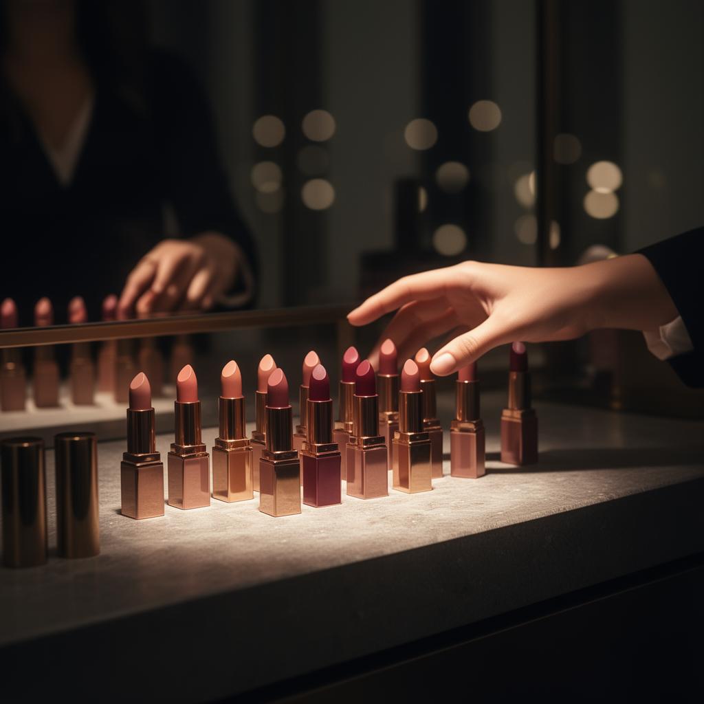
Beauty advisors guide people across sister brands under the same umbrella in real time. There isn't much room to pause, look something up, or guess.

Challenge

Decision fatigue on both sides.

Dense catalogs flood the moment. The advisor needs clarity. The customer needs to feel sure.

Goal

Make the next decision feel small.

Start with color. Narrow the options across sister brands. Keep the human conversation in the foreground. Let the interface do the quiet work.

Atmosphere · The counter moment

A quiet, decisive object — held under warm light, considered before it's chosen.

03Experience principles

Where design, decision support, and real-time usability meet.

Guided interaction

Choices unfold in a paced, intentional sequence.

Visual hierarchy

Attention lands on the decision, never the noise.

Restrained usability

Quiet typography and motion frame the moment as advisory.

Human-centered

Built for the advisor guiding and the customer being guided.

Organizational outcomes

What guided discovery produces.

A practice architecture for product confidence — earned through exploration, not lectured.

Confidence

Frontline product confidence built through guided discovery instead of memorization.

Autonomy

Learners navigate complexity on their own terms, at their own pace.

Retention

Concepts hold because the learner constructed the path to them.

Workflow

Discovery patterns map cleanly into real customer conversations.

Scale

A repeatable model for new product lines and refresh cycles.

Empathy

Designers and product teams see how the work lands in the field.

Step inside

Move through the guided flow as an advisor would.

The thread

Guiding the live color decision so the human conversation stays in the foreground — and the catalog quietly steps back.